Authorize with Embedded Link
Swiftly embed our auth flow in your application UI using our low-code component
Overview
Embedded Link is a pre-built JavaScript component that neatly sits in your front-end code and can be deployed in a matter of minutes. Use it to benefit from our extensive experience in building authorization flows melded with best practices, while seamlessly embedding it into your webpage or front-end application.
The component works with all major JavaScript frameworks, including React, and also with vanilla JavaScript. You can choose to implement the component in TypeScript.
We built Embedded Link to be flexible so that you can integrate and initialize it in any way you want, and provide the user with a native feel of your authorization journey.
Features
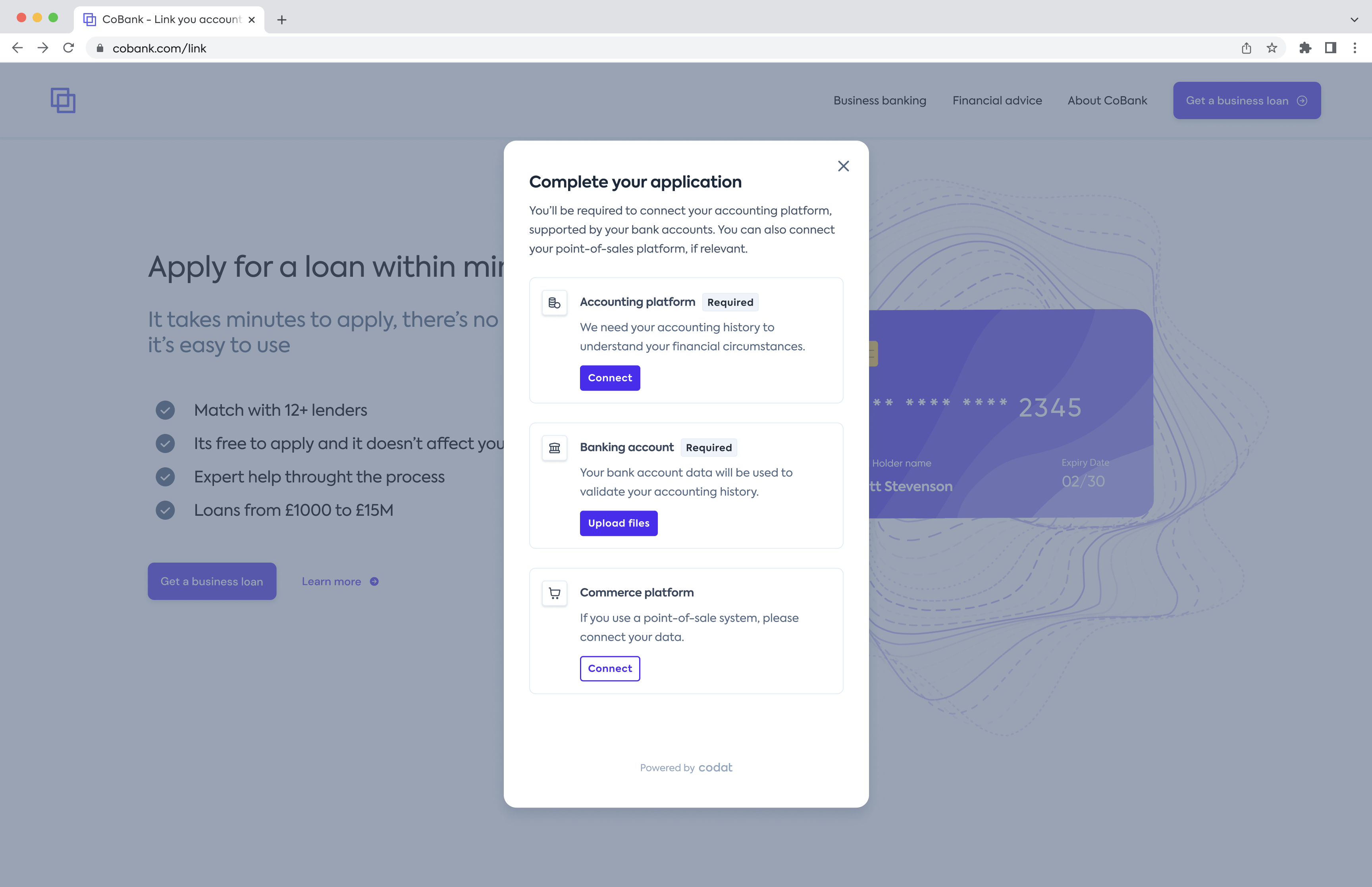
- Intuitive UI based on our expertise and learned best practices ensures a high-converting auth flow
- Authentication in line with OAuth 2.0 standards
- Customizable UI that reflects your company branding
- React and non-React JavaScript compatible pre-built component for fast implementation
- Dynamic imports mean your auth flow will never fall behind our API
npm is the default package manager for JS development. However, where a package is highly coupled to an API, version control becomes a big risk to the integrity of your application. This is particularly the case for Codat's APIs as they are are non-versioned (see our change management policy).
Link SDK is imported at runtime, meaning you'll always get the latest version of our auth flow UI, and there's no risk of staleness vs. our APIs. To achieve this, we make use of ES6's import() feature (aka dynamic imports).
As with all Codat products, Link SDK is still subject to our change management policy and appropriate notice will be given for changes to our auth flow UI and any associated APIs. We have rigorous testing and security measures in place to ensure you can import our SDK with confidence.
Resources
We've provided a repo with examples on GitHub that illustrate how to add the Embedded Link component to your project.
Prerequisites
- Customized auth flow settings If you haven't already done so, customize Link on the Link settings page in the Codat Portal. For example, add UI copy, set file upload options, choose to make steps optional, or disable steps. The settings apply to both Embedded Link and Hosted Link.
- Your application
You'll need a JavaScript application to render the component in (e.g. React, Angular). It should take care of creating companies programmatically and retrieving the
companyIdof any company you want to authorize.
Get started
Take advantage of our npm package so you don't have to manually import and maintain type definitions. You will benefit from it the most if you are using Typescript, so our examples are prepared with that assumption.
npm install @codat/sdk-link-types
- React
- NextJS
- JavaScript
- Angular
- Vue
- Svelte
Get started with React
For an example of the component in action, see our demo app.
Create a component that mounts the SDK. You can copy and paste the example
CodatLink.tsxfile to an appropriate location in your React or TypeScript app. We recommend settingwidth: 460px; height: 840pxfor this component.Use the component. We suggest wrapping the
CodatLinkcomponent in a modal to adjust its positioning. The component can also take care of such logic as when to display the component, passing in the relevant company ID and callbacks.// AuthFlow.tsx
import {
ConnectionCallbackArgs,
ErrorCallbackArgs,
} from "@codat/sdk-link-types"
import { useState } from "react";
import { CodatLink } from "./components/CodatLink";
export const AuthFlow = ({ companyId }: {companyId: Company["id"]}) => {
const [modalOpen, setModalOpen] = useState(false);
const onConnection = (connection: ConnectionCallbackArgs) =>
alert(`On connection callback - ${connection.connectionId}`);
const onClose = () => setModalOpen(false);
const onFinish = () => alert("On finish callback");
const onError = (error: ErrorCallbackArgs) =>
alert(`On error callback - ${error.message}`);
return (
<div>
<p>Some content</p>
<button onClick={() => setModalOpen(true)}>
Start authing
</button>
{modalOpen && (
<div className="modal-wrapper">
<CodatLink
companyId={companyId}
onConnection={onConnection}
onError={onError}
onClose={onClose}
onFinish={onFinish}
/>
</div>
)};
</div>
);
};Conditional steps
- If you're using TypeScript extend your type declarations with our types by installing the types package -
npm install --save-dev @codat/sdk-link-types.- If you're not using TypeScript, just delete the type related code in the snippets.
- If you're using content security policy (CSP) headers you'll need to edit these headers:
- Allow-list Codat by adding
*.codat.iotodefault-src(or each of ofscript-src, style-src, font-src, connect-src, img-src). - Add
unsafe-inlinetostyle-src. Do not use a hash because this can change at any time without warning.
- Allow-list Codat by adding
- If you're using TypeScript extend your type declarations with our types by installing the types package -
Get started with NextJS
For an example of the component in action, see our demo app.
NextJS is opinionated about the import strategy we're suggesting, and has an experimental feature called urlImports. If you follow our NextJS example, you'll be warned you need to use the urlImports feature. Link SDK and urlImports are not compatible, because NextJS assumes the resources are static and caches the SDK, causing various issues.
In the example below, you'll see that we make use of webpack's magic comments feature to avoid NextJS's caching and use normal import() behaviour.
Create a component that mounts the SDK. You can copy and paste the example
CodatLink.tsxfile to an appropriate location in your app. We recommend settingwidth: 460px; height: 840pxfor this component. Note that"use client"is used in the script to define this as client-side code, and the import is ignored in webpack to avoid NextJS caching (as above).Use the component. We suggest wrapping the
CodatLinkcomponent in a modal to adjust its positioning. The component can also take care of such logic as when to display the component, passing in the relevant company ID and callbacks.// page.tsx
"use client";
import {
ConnectionCallbackArgs,
ErrorCallbackArgs,
} from "@codat/sdk-link-types"
import { CodatLink } from "./components/CodatLink";
import Image from "next/image";
import styles from "./page.module.css";
import { useState } from "react";
export default function Home() {
const [companyId, setCompanyId] = useState(""); //provide company ID
const [modalOpen, setModalOpen] = useState(false);
const onConnection = (connection: ConnectionCallbackArgs) =>
alert(`On connection callback - ${connection.connectionId}`);
const onClose = () => setModalOpen(false);
const onFinish = () => alert("On finish callback");
const onError = (error: ErrorCallbackArgs) =>
alert(`On error callback - ${error.message}`);
return (
<main className={styles.main}>
// ... some other components
{modalOpen && (
<div className={styles.modalWrapper}>
<CodatLink
companyId={companyId}
onConnection={onConnection}
onError={onError}
onClose={onClose}
onFinish={onFinish}
/>
</div>
)}
</main>
);
};Conditional steps
- If you're using TypeScript extend your type declarations with our types by installing the types package -
npm install --save-dev @codat/sdk-link-types.- If you're not using TypeScript, just delete the type related code in the snippets.
- If you're using content security policy (CSP) headers you'll need to edit these headers:
- Allow-list Codat by adding
*.codat.iotodefault-src(or each of ofscript-src, style-src, font-src, connect-src, img-src). - Add
unsafe-inlinetostyle-src. Do not use a hash because this can change at any time without warning.
- Allow-list Codat by adding
- If you're using TypeScript extend your type declarations with our types by installing the types package -
Get started with JavaScript
For an example of the component in action, see our demo app.
Create a target
divfor theCodatLinkcomponent. The CodatLink component will be mounted within this div. We recommend settingwidth: 460px; height: 840pxfor this element.- It should have an
idofcodat-link-container. - We suggest styling it as a modal by nesting it within a modal wrapper (e.g.
position: fixed; inset: 0).
The created
CodatLinkcomponent expands to fit 100% of the specified dimensions.- It should have an
Import the Link SDK component. If you're using the component inside a
scripttag, the tag must havetype="module"set.import { CodatLink } from "https://link-sdk.codat.io";Define callbacks.
const closeCallback = () => {
 linkSdkTarget.style.pointerEvents = "none";
 linkSdkTarget.removeChild(linkSdkTarget.children[0]);
};

const onClose = () => closeCallback();
const onConnection = (connection) =>
 alert(`On connection callback  = ${connection.connectionId}`);
const onFinish = () => alert("On finish callback");
const onError = (error) => alert(`On error callback : ${error.message}`);
Initialize the Link SDK component in your app. You'll need to supply the
companyIdof the company you want to authorize:const target = document.querySelector("#codat-link-container");
const openModal = () => {
linkSdkTarget.style.pointerEvents = "initial";
new CodatLink({
target: linkSdkTarget,
props: {
companyId,
onConnection,
onClose,
onFinish,
onError,
},
});
};Conditional steps
- If you're using TypeScript extend your type declarations with our types. Download the
types.d.tsfile, then copy and paste its contents into a new or existing.d.tsfile. - If you're using content security policy (CSP) headers you'll need to edit these headers:
- Allow-list Codat by adding
*.codat.iotodefault-src(or each of ofscript-src, style-src, font-src, connect-src, img-src). - Add
unsafe-inlinetostyle-src. Do not use a hash because this can change at any time without warning.
- Allow-list Codat by adding
Get started with Angular
For an example of the component in action, see our demo app.
In the example below, you'll see that we make use of webpack's magic comments feature to avoid Angular's caching and use normal import() behaviour.
Create a component that mounts the SDK. See the
codat-link folderfor an example module.Define company ID and callbacks.
//app.component.ts

  companyId = '';//provide company ID
  linkOpen = false;

  openLink() {
    if (this.companyId) {
      this.linkOpen = true;
    }
  }

  closeLink() {
    this.linkOpen = false;
  }

  onConnection(connection: ConnectionCallbackArgs) {
    alert(`On connection callback : ${connection.connectionId}`);
  }

  onError(error: ErrorCallbackArgs) {
    alert(`On error callback : ${error.message}`);
  }

  onFinish() {
    alert('On finish callback');
  }
- Use the component.
<!-- app.component.html -->

<button (click)="openLink()">Start authing</button>
  <app-codat-link
    [companyId]="companyId"
    (connection)="onConnection($event)"
    (close)="closeLink()"
    (error)="onError($event)"
    (finish)="onFinish()"
    *ngIf="linkOpen"
  ></app-codat-link>
- Conditional steps
- If you're using TypeScript extend your type declarations with our types. Download the
types.d.tsfile, then copy and paste its contents into a new or existing.d.tsfile. - If you're using content security policy (CSP) headers you'll need to edit these headers:
- Allow-list Codat by adding
*.codat.iotodefault-src(or each of ofscript-src, style-src, font-src, connect-src, img-src). - Add
unsafe-inlinetostyle-src. Do not use a hash because this can change at any time without warning.
- Allow-list Codat by adding
- If you're using TypeScript extend your type declarations with our types. Download the
Get started with Vue
For an example of the component in action, see our demo app.
Create a component that mounts the SDK. You can copy and paste the example
CodatLink.vuefile to an appropriate location in your Vue app. We recommend settingwidth: 460px; height: 840pxfor this component.Use this component. We suggest wrapping the
CodatLinkcomponent in a modal to adjust its positioning. The component can also take care of such logic as when to display the component, passing in the relevant company ID and callbacks.
// App.vue

<script setup lang="ts">
  import CodatLink from './components/CodatLink.vue'
  import { ref } from 'vue'
  import type { ConnectionCallbackArgs, ErrorCallbackArgs } from 'https://link-sdk.codat.io'

  const companyId = ref('') //provide company ID
  const modalOpen = ref(false)

  const onConnection = (connection: ConnectionCallbackArgs) =>
    alert(`On connection callback - ${connection.connectionId}`);
  const onClose = () => (modalOpen = false);
  const onFinish = () => alert("On finish callback");
  const onError = (error: ErrorCallbackArgs) =>
    alert(`On error callback - ${error.message}`);

</script>

<div class="app">
  <main>
      {#if modalOpen}
      <div class="modal-wrapper">
        <CodatLink {companyId} {onConnection} {onClose} {onError} {onFinish} />
      </div>
    {/if}
  </main>
</div>
Conditional steps
- If you're using TypeScript extend your type declarations with our types. Download the
types.d.tsfile, then copy and paste its contents into a new or existing.d.tsfile. - If you're using content security policy (CSP) headers you'll need to edit these headers:
- Allow-list Codat by adding
*.codat.iotodefault-src(or each of ofscript-src, style-src, font-src, connect-src, img-src). - Add
unsafe-inlinetostyle-src. Do not use a hash because this can change at any time without warning.
- Allow-list Codat by adding
- If you're using TypeScript extend your type declarations with our types. Download the
Get started with Svelte
For an example of the component in action, see our demo app.
Create a component that mounts the SDK. You can copy and paste the example
CodatLink.sveltefile to an appropriate location in your Svelte app. We recommend settingwidth: 460px; height: 840pxfor this component.Use the component. We suggest wrapping the
CodatLinkcomponent in a modal to adjust its positioning. The component can also take care of such logic as when to display the component, passing in the relevant company ID and callbacks.
// App.svelte

<script lang="ts">
  import CodatLink from "./lib/CodatLink.svelte";
  import type {
    ConnectionCallbackArgs,
    ErrorCallbackArgs,
  } from "https://link-sdk.codat.io";

  let modalOpen = false;
  let companyId = "" //provide company ID

  const onConnection = (connection: ConnectionCallbackArgs) =>
    alert(`On connection callback - ${connection.connectionId}`);
  const onClose = () => (modalOpen = false);
  const onFinish = () => alert("On finish callback");
  const onError = (error: ErrorCallbackArgs) =>
    alert(`On error callback - ${error.message}`);

</script>

<div class="app">
  <main>
      {#if modalOpen}
      <div class="modal-wrapper">
        <CodatLink {companyId} {onConnection} {onClose} {onError} {onFinish} />
      </div>
    {/if}
  </main>
</div>
Conditional steps
- If you're using TypeScript extend your type declarations with our types. Download the
types.d.tsfile, then copy and paste its contents into a new or existing.d.tsfile. - If you're using content security policy (CSP) headers you'll need to edit these headers:
- Allow-list Codat by adding
*.codat.iotodefault-src(or each of ofscript-src, style-src, font-src, connect-src, img-src). - Add
unsafe-inlinetostyle-src. Do not use a hash because this can change at any time without warning.
- Allow-list Codat by adding
- If you're using TypeScript extend your type declarations with our types. Download the
Advanced options
Most of the configuration for the auth flow is currently managed in Link settings page in the Codat Portal.
If you need more control over the UI based on application-specific logic or want to vary it conditionally, we offer programmatic control via a new options property that overrides the Link settings set in the Portal.
<CodatLink
  companyId={companyId}
  onConnection={onConnection}
  onError={onError}
  onClose={onClose}
  onFinish={onFinish}
  options={{nonModal: true ...}}
/>
As the options object overrides the Link settings set in the Portal, this may result in confusion about the source of truth for what users are seeing. Ensure you document and communicate your use of the options prop internally.
The options prop is optional and accepts an object containing the following optional properties:
| Property | Description |
|---|---|
nonModal | Determines whether Link is initialized with non-modal styling (no border and no close button). |
showLandingPage | Determines whether an extra landing page is displayed to the user at the start of Link. |
showSandboxIntegrations | Controls whether integrations that only connect Sandbox data are displayed for selection. |
theme | Contains options that control the visual appearance of the Link flow. |
sourceTypes | Controls the data source types (Accounting, Commerce, Banking, and Business Documents) the user can connect or upload files for. |
text | Contains options that control what text is displayed to the user. Markdown is supported. |
The object is applied as the CodatLink component is mounted and doesn't support reloading. Make sure to modify the options before mounting the component.
Non-modal styling
By default, the Link component is designed to be presented in a modal. To override this, you can use the nonModal options setting. When set to true, it will:
- Hide the close icon.
- Remove the modal-styled border and padding.
You can see an example of this on GitHub.
Landing page
When showLandingPage property is set to true, an extra page is displayed to the user at the start of the Link flow. When set to false, the user is directed straigt to the navigation page.
Sandbox integrations
The showSandboxIntegrations property controls whether Sanbox integrations are displayed for selection. This should be set to true for test environments and false for live environments.
Theme
Use the colors property of the theme option to set the hex value for the primary color for buttons, links, and loading animations.
Source types
The sourceTypes option controls the source types the user can connect via the Link flow. Use the accounting, banking, commerce, and businessDocuments properties to indicate the desired source type. If you want a source type to be displayed, you must also provide its following properties:
optional: when set totrue, the user can complete the flow without connecting an integration of the specified type or uploading relevant files.enableIntegrations: when set totrue, it enables the user to connect to an integration of the specified type.enableFileUpload: when set totrue, it allows the user to upload relevant documents. You must also enable the relevant file upload integrations in Other integrations.
Custom text
Use the text property to override text displayed within the Link UI. For example, you can detect the language the user speaks and set the displayed text according to their locale. You can see a simple example of this on GitHub.
The property accepts Markdown, meaning you can add links, lists, tables, and more to your text. You can override the following text options:
| Option | Description |
|---|---|
companyName | Your company name displayed on the final page of the flow before connecting an integration |
landing.title | Landing page title displayed on the first page the user sees. To use this, enable the landing page by setting CodatLinkOptions.showLandingPage to true or configuring it in Link settings. |
landing.subtitle | Landing page subtitle displayed on the first page the user sees. To use this, enable the landing page by setting CodatLinkOptions.showLandingPage to true or configuring it in Link settings. |
main.title | Title displayed on the page where the user selects what source types to connect |
main.subtitle | Subtitle displayed on the page where the user selects what source types to connect. |
accounting.fileUpload.subtitle | Subtitle displayed on the accounting file upload page. To use this, enable the accounting file upload by setting the sourceTypes.accounting.enableFileUpload option to true or by configuring it in Other integrations. |
banking.fileUpload.subtitle | Subtitle displayed on the banking file upload page. To use this, enable the banking file upload by setting the sourceTypes.banking.enableFileUpload option to true or by configuring it in Other integrations. |
businessDocuments.fileUpload.subtitle | Subtitle displayed on the business documents file upload page. To use this, enable the business documents file upload by setting the sourceTypes.businessDocuments.enableFileUpload option to true or by configuring it in Other integrations. |
accounting.dataAccess.consent | Text displayed on the final flow page before connecting an accounting platform, underneath the list of data types. If you want to display a terms and conditions link, add it here using Markdown. |
banking.dataAccess.consent | Text displayed on the final flow page before connecting a bank account, underneath the list of data types. If you want to display a terms and conditions link, add it here using Markdown. |
commerce.dataAccess.consent | Text displayed on the final flow page before connecting a commerce platform, underneath the list of data types. If you want to display a terms and conditions link, add it here using Markdown. |
accounting.dataAccess.dataTypes | List of requested data types displayed on the final flow page before connecting an accounting platform. |
banking.dataAccess.dataTypes | List of requested data types displayed on the final flow page before connecting a bank account. |
commerce.dataAccess.dataTypes | List of requested data types displayed on the final flow page before connecting a commerce platform. |
Changelog
November 2023
- Options property: we introduced a new prop that gives you programmatic control over Link settings.
- Markdown support: text fields now accept Markdown, giving you more control over styling and formatting. This is available via the
textproperty for Embedded Link only. - @codat/sdk-link-types package released: our new NPM package means you don't have to manually import and maintain the type definitions.
October 2023
- Support for non-modal views: you can now embed the component in non-modal views with our new
optionsprop. - Reduced latency after auth: we now poll every second to check whether the user has authed, meaning connection is confirmed faster.
- Bugs:
- Fixed an issue where 'Landing page' settings were not reflected.
June 2023
- Support for non-React JavaScript apps: without a dependency on React, you can use Embedded Link with all JavaScript frameworks or even vanilla JavaScript.
- Increased display control: you now need to specify the dimensions of the Embedded Link component, which will expand to fit the given container size. Previously the component used a fixed width and height.
- Navigation improvements: source types (accounting, commerce, banking, and file upload) can now be connected in any order you choose.
- Performance improvements: Link loads quicker and can be loaded only when required.
- Connection status: the connection status (success or error) is now shown during the Embedded Link flow. The SMB user can skip errors without interrupting the rest of the Link flow.