Lending in the Portal
Codat's no-code product that provides insights about a company's data to help make informed lending decisions
Lending in the Portal leverages Codat APIs to produce features that serve data on the health of a business and provide insights required for making informed lending decisions. Lending consists of five sections: Profit and Loss, Balance Sheet, Commerce, Banking and Marketing.
To benefit from all of the features of Lending, a company should be linked to accounting, banking and commerce data sources. Explore our How to get started guide.
The categorized Profit and Loss, and Balance Sheet showcase the power of the Categories feature which standardizes bespoke data across SMEs. After the data is standardized, meaningful insights and measurements are produced for financial performance.
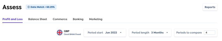
Data Match
The data match percentage button is located next to the Lending header on every Lending page and it leverages the Data Integrity feature. The match percentage is pre-calculated using the Data Integrity summaries endpoint.
It takes the match percentage from the summaries endpoint for both banking-transactions and accountTransactions to calculate an overall match percentage, and it accounts for all dates, not just the optimal date range.
Hovering over the button reveals further detail about the data match. Clicking the Data match button takes you to the Data Integrity page which provides detailed information about matches. Explore Data Integrity.
Reports
The Reports button is located in the top right corner of every Lending page and directs you to the Reports page in the Portal.
Lending sections
Profit and Loss
The Profit and Loss page is the landing page when accessing Lending. The page consists of a graph displaying selections for the categorized financial statement, and ratios. If you have uncategorized accounts, the Account Categorization modal will be displayed. Only uncategorized accounts will be shown and you will need to manually assign categories. Our Categorization of accounts documentation provides more detail.
Selection panel
Currency: The currency displayed in the profit and loss statement. This is predefined for the P&L and reflects the currency in the accounting platform.
Period start: Periods are defined in months. Financial statements are backward looking, so this is the period you want to start looking back from. The system will prefill the latest full month available in the company's data. If you select a month that’s out of range, the system will notify you of the latest available month for the company.
Period length: Specified in months.
Periods to compare: The number of periods for which calculated data is returned and compared.
Select the Period start, Period length and Periods to compare to achieve the views you want. For example:
If you want a monthly view of the last 12 months:
Period start = latest month (prepopulated for you)
Period length = 1 (month)
Periods to compare = 12
If you want to view the last 4 full quarters:
Period start = choose the last month of the last quarter you want to choose, e.g. June 2022
Period length = 3
Periods to compare = 4
Mapping to a common statement outline
On load, we will automatically categorize the lines on the business's profit and loss statement. The results will be presented in a modal for you to review. When you are finished reviewing each group, press Next. In some cases, we may not be able to automatically map every statement line - these will highlight in red and you will be required to select the relevant category from the list. Once complete, press Save to view the final statement.
Statement
The categorized profit and loss statement is obtained from the Enhanced Profit and Loss endpoint. It provides a fully categorized statement over specified periods of time, for a specific company’s accounting connection.
The following information is displayed:
- Income
- Expense
- Gross profit
- Net operating profit
- Net profit
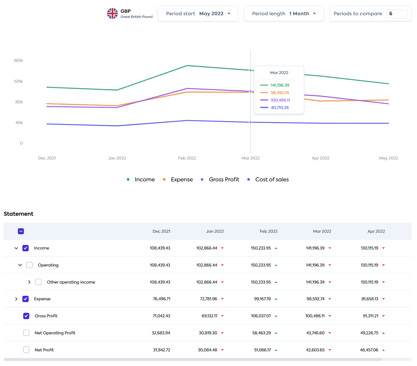
The Statement table renders the Enhanced Profit and Loss endpoint response data to give a clear visual of the company’s performance over the specified periods. The green and red arrowheads alongside the numbers indicate an increase or decrease respectively compared to the previous period.
Rows can be expanded or collapsed to show more or less information. A maximum of 5 checkboxes can be checked, like Income above, to display the selection on the graph. Hovering over the graph displays a tooltip which contains information about all of the points plotted for that date.
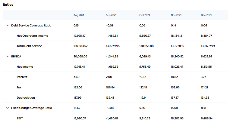
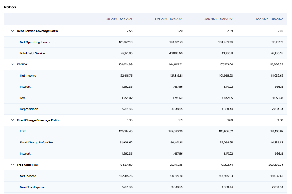
Ratios
Ratios are produced from the Financial Metrics endpoint. It provides a set of pre-calculated ratios and metrics used to assess a company’s financial performance. The Financial Metrics feature performs complex calculations on fully standardized financial statements to produce the following financial metrics and ratios (see formulas):
- Gross Profit Margin
- EBITDA
- Debt Service Coverage Ratio
- Current Ratio
- Quick Ratio
- Free Cash Flow
- Working Capital
- Fixed-charge Coverage Ratio
The Ratios table is displayed below the Statement table. Each metric/ratio can be expanded to show the inputs and values used to calculate the metric (see extract of the Ratios table below).
Balance Sheet
The Balance Sheet page consists of a graph displaying selections for the categorized balance sheet, a statement and ratios.
The balance sheet statement provides the fully categorized statement over specified periods of time, for a specific company’s accounting connection.
Check Prerequisites to make sure you have the required data types enabled.
The Data match percentage displayed in the top right is a comparison of how closely the accounting data aligns with banking data.
Selection panel

Currency: The currency displayed in the balance sheet statement. This is predefined for the balance sheet and reflects the currency in the accounting platform.
Period start: Periods are defined in months. Financial statements are backwards looking, so this is the period you want to start looking back from. The system will prefill the latest full month available in the company's data. If you select a month that’s out of range, the system will notify you of the latest available month for the company.
Period length: Specified in months.
Periods to compare: The number of periods for which calculated data is returned and compared.
Select the Period start, Period length and Periods to compare to achieve the views you want. For example:
If you want a monthly view of the last 12 months
Period start = latest month (prepopulated for you)
Period length = 1 (month)
Periods to compare = 12
If you want to view the last 4 full quarters
Period start = choose the last month of the last quarter you want to choose, e.g. June 2022
Period length = 3
Periods to compare = 4
Balance Sheet statement and graph
The statement displays balance sheet data based on the Period start, Period length and Periods to compare specified at the top of the screen.
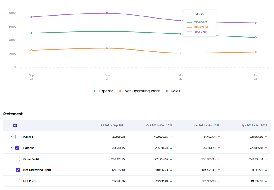
Statement format
Each statement has four levels. The fourth level is the original line item (general ledger account) in the company’s accounting package. The first three levels represent a smart categorization layer that we have applied. If you want to change the group that a line item is categorized to, you can do this by following the instructions for categorizing accounts.
Categorizing debit accounts
Debit accounts are categorized as Asset > Current assets > Cash. However, when the debit account is in overdraft over a given period, the Enhanced Balance Sheet automatically categorizes it as Liability > Non-current liabilities > Loans payable, and changes the sign from negative to positive.
Statement and graph options
Green and red arrows: Positioned alongside the numbers, they indicate an increase or decrease respectively compared to the previous period.
Statement rows: These can be expanded to view a breakdown of each value. A maximum of five checkboxes can be checked, like Net Operating Profit above, to display the selection on the graph. Hovering over the graph displays a tooltip which contains information about all the points plotted for that month.
Ratios
The ratios and metrics are calculated from the data in the statement above and use the same period configuration as set at the top of the screen. The supported metrics are (see formulas):
- Current Ratio
- Debt Service Coverage Ratio
- Free Cash Flow
- Quick Ratio
- Working Capital
The Ratios table is displayed below the Statement table. Each metric/ratio can be expanded to show the inputs and values used to calculate the metric (see the extract of the Ratios table below).
Developer - Feature box
If you are a developer, and you are looking to reproduce the outputs of this section, refer to the following API documentation:
- Enhanced Balance Sheet: To produce the balance sheet statement table and graph.
- Financial Metrics: To produce the ratios table.
- Data Integrity: To produce the Data match percentage.
Commerce
The Commerce page consists of the sales analysis and key indicators of merchant health. The Commerce Metrics endpoints are used to generate the graphs and metrics displayed on this page.
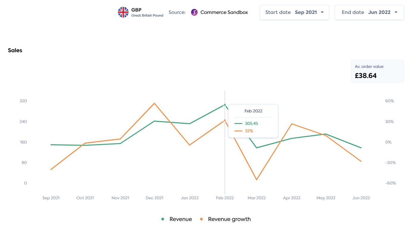
Sales
The Sales section provides a revenue graph generated from the Revenue endpoint, and displays the average order value for the date range selected. The dropdown to the right of the graph gives you the option to map Revenue (represented as a currency) or Revenue growth (represented as a percent). Hovering over the graph displays a tooltip that contains information about the point plotted for that date.
Merchant Health
The Merchant Health section displays customer information. You can select graphs for New vs. existing customers or Orders vs. refunds. Hovering over the graph displays the value for each of these at that point in time.
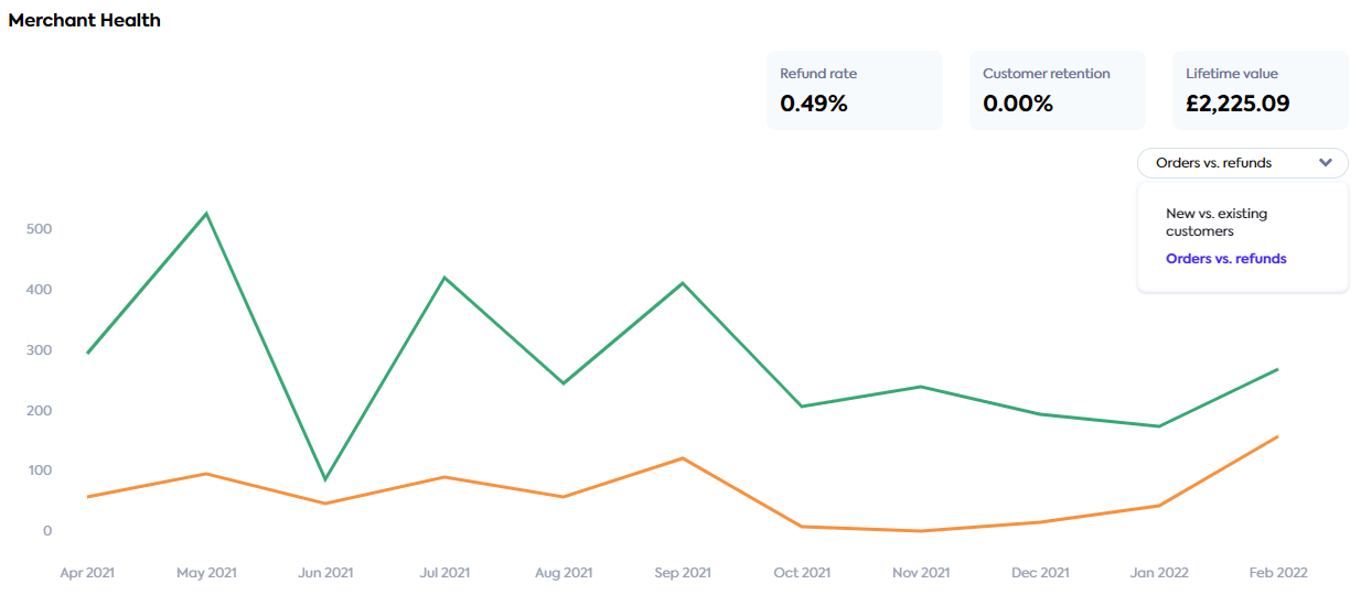
The following metrics are displayed as follows:
- New vs. existing customers (graph)
- Orders vs. Refunds (graph)
- Refund rate (pill)
- Customer retention (pill)
- Lifetime value (pill)
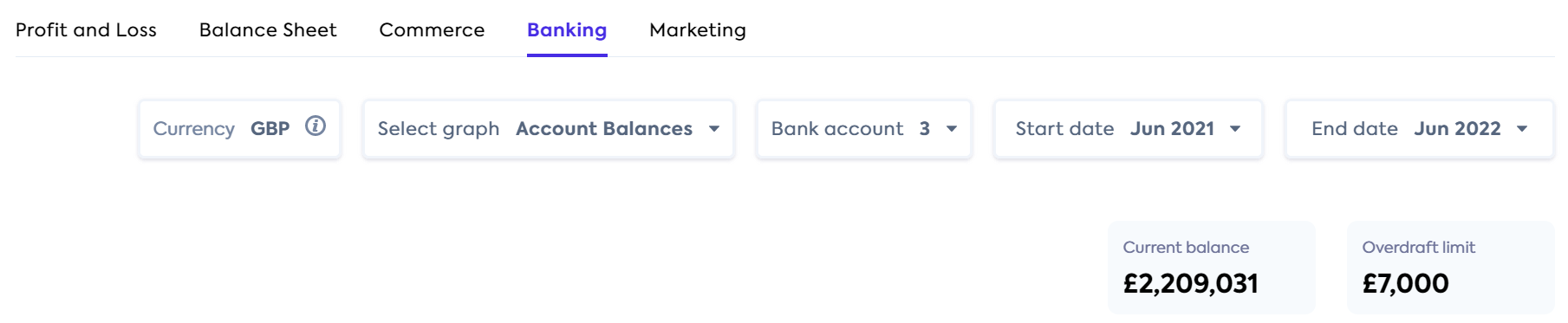
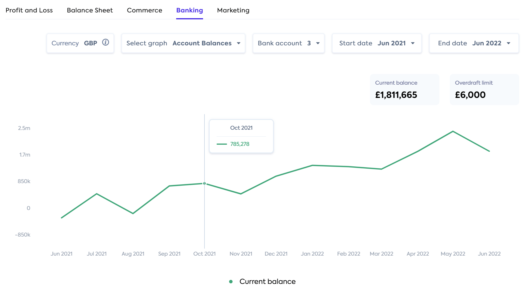
Banking
The Banking page displays the latest current balance, overdraft limit and a graph of either account balances or inflows vs outflows depending on which you select.
The selection panel lets you choose:
- Which graph you want displayed – Account balances or Inflows vs outflows.
- The company's bank accounts that are included in the graph – by default, you are unable to deselect all accounts.
- Start and end month.
All the banking values on the UI are currently converted to GBP. There may be the ability to convert to other currencies in a future release.
The balance and the Account limits displayed are aggregate views for the selected bank accounts and are values as of the end date of the report.
Account Balances graph
This graph displays when chosen in the Select graph dropdown. Hovering over the graph displays a tooltip containing the total account balance for the selected bank accounts.
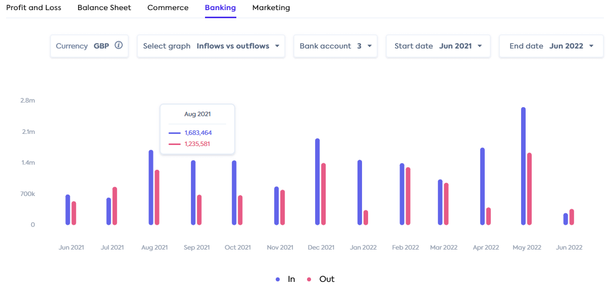
Inflows vs outflows graph
This graph displays when chosen in the Select graph dropdown. Hovering over the graph displays a tooltip containing the total inflows and outflows for the selected bank accounts for that month.
The graph is produced from the Banking transactions endpoint response.
Transaction table
The transaction table displays below the Inflows vs outflows graph and contains all transactions for the selected bank accounts, for the selected dates. Clicking the Date column header orders the transactions by ascending, descending or unordered date.
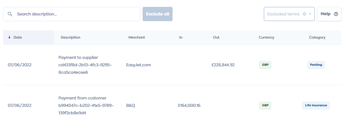
Exclude transactions
The filter and exclude functionality is currently unavailable for Plaid-connected companies.
You can type into a search bar located above the table to find matches in the Description column. As you type, the table refreshes with all transactions that match the search term. In the search bar, to the right, the number of matching transactions is displayed in grey and the Exclude all button becomes active.
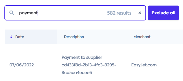
Clicking the Exclude all button removes the filtered results from the transaction table. The transaction table then goes back to displaying the remaining transactions for the selected dates and the graph is updated. The Excluded terms box to the top right of the table, displays all excluded terms in a drop down menu.
Terms that were excluded are stored locally in the browser and will continue to be excluded whenever you access Inflows vs outflows.
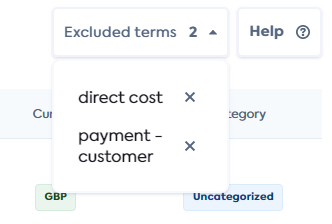
To review an existing excluded term, clicking on the term itself within the Excluded terms drop down adds it to the search bar. The transactions linked to the term are displayed in grey in the table. To reinstate a transaction back into the transactions table, click the X alongside the excluded term. The graph and the transaction table updates to include the term.
Marketing
The Marketing page displays graphs for the Marketing to revenue and Marketing to expense metrics, and a table of the percentages and metric inputs. These marketing metrics are calculated from accounting data. It is generated from data available on the customer's profit and loss statement (see formulas).
Selection panel
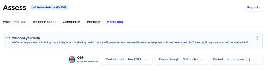
The dismissible banner displayed at the top of the Marketing page invites you to our product roadmap to let us know which platforms and insights you would be interested in.
Currency: This reflects the currency in the accounting platform.
Period start: Periods are defined in months. Statements are backwards looking, so this is the period you want to start looking back from. The system will prefill the latest full month available in the company's data. If you select a month that’s out of range, the system will notify you of the latest available month for the company.
Period length: Specified in months.
Periods to compare: The number of periods for which calculated data is returned and compared.
Select the Period start, Period length and Periods to compare to achieve the views you want. For example:
If you want a monthly view of the last 12 months
Period start = latest month (prepopulated for you)
Period length = 1 (month)
Periods to compare = 12
If you want to view the last 4 full quarters
Period start = choose the last month of the last quarter you want to choose, e.g. June 2022
Period length = 3
Periods to compare = 4
Marketing data and graph
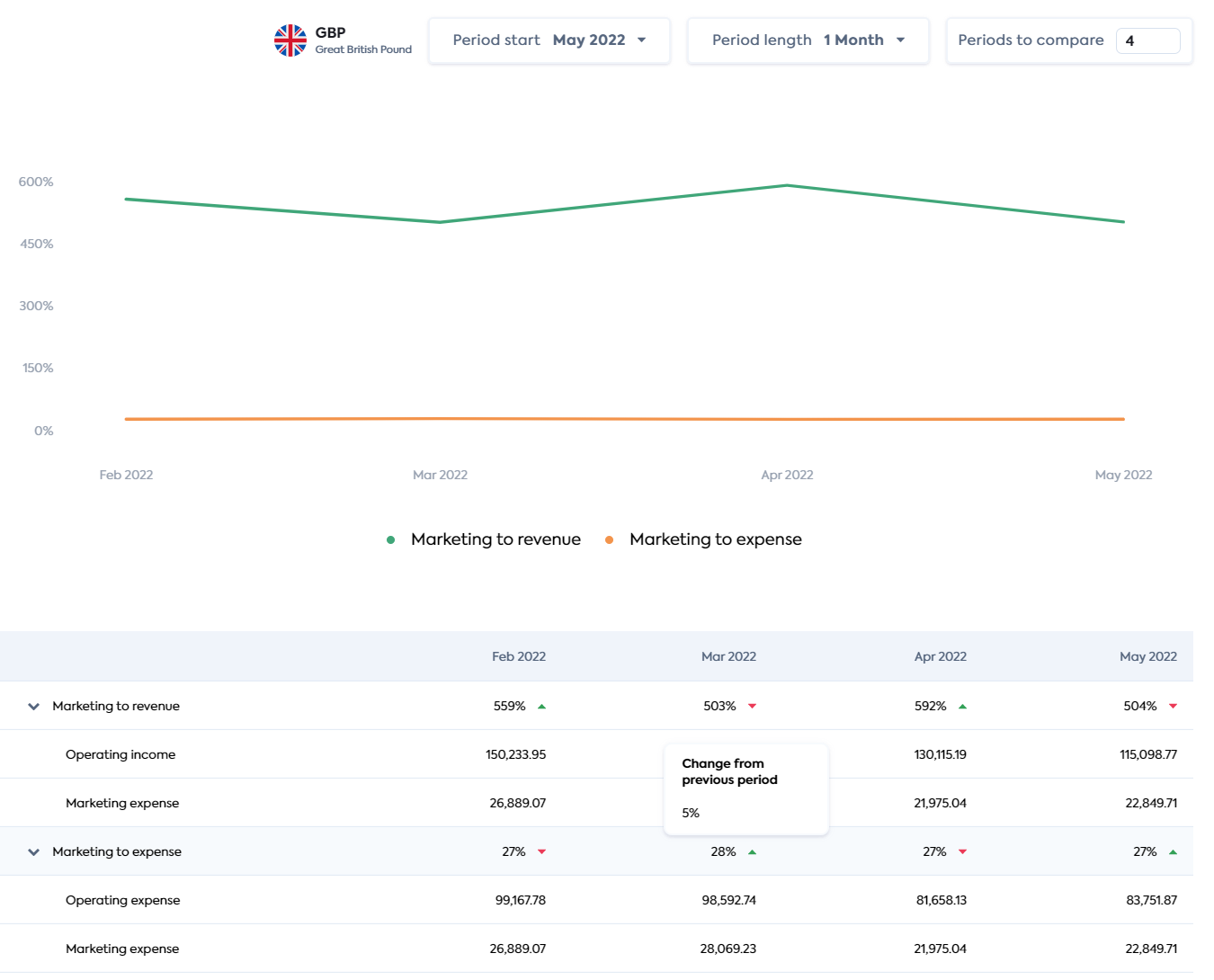
The Marketing Metrics endpoint is used to generate the graphs and metrics displayed on this page. The green and red arrowheads alongside the numbers indicate an increase or decrease respectively compared to the previous period.
See the API reference.
Rows can be expanded or collapsed to show more or less information. Hovering over the graph displays a tooltip which contains information about the points plotted for that date.
Reports
A Reports button is located in the top right corner of every Lending page. It takes you to the Reports page where you can generate and download various reports in Excel format.
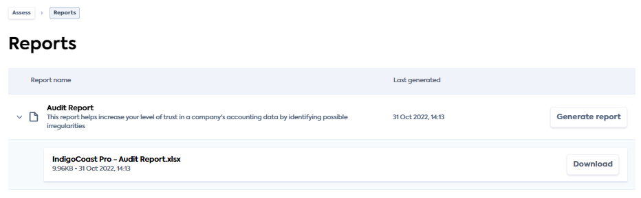
The Report name provides the name of the report and an informative description of the report's objectives.
Click the Generate report button to produce a new report. The Last generated field will be updated to the date and time you generated the report. It will keep this timestamp until the next time you generate the report.
When a report was successfully generated, the report name (which is also the file name), with the file size and latest timestamp will be available for download. Clicking the Download button saves the Excel report to your local machine.
Report types
- Audit Report: Identifies indicators of inaccurate or out-of-date accounts, helping you to decision with confidence
- Enhanced Cash Flow Report: Contains enhanced cash flow data
- Enhanced Financials Report: Contains enhanced profit and loss and balance sheet data, allowing you to calculate key metrics
- Enhanced Invoices Report: Contains enhanced invoices which are linked to payments